<img src="https://secure.leadforensics.com/84817.png" style="display:none;">

Marketing Data Visualizations that Your CEO Will Love

Inbound Marketing | | 7 minute read

Your experience and proven success in marketing landed you the honor of reporting data to your CEO. How do you best demonstrate your expertise to your C-Suite? The solution is in data visualization and presentation techniques.  

Before developing a presentation, you must determine what information is most relevant to your audience and how it relates to your goals. Presentation goals could include proving your case for additional staff, reallocation of funds from one project to another, or any other worthwhile cause requiring an executive-level decision. Executive decisions are rarely based on gut feelings and blind recommendations. By grounding your information in facts in the form of data, you gain credibility in your organization and demonstrate your ability to relate to people at any level, including potential clients.  

Gather Your Marketing Campaign KPIs

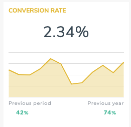
In our previous post, we discussed the top 3 Marketing KPIs Your CEO Cares About:

  • Customer Acquisition Cost,
  • Customer Lifetime Value,
  • and Conversion Rates.

These data points alone do not say much, but in relation to one another, you can tell the story of growing trends, brand effectiveness, and budget utilization. 

Creating visual demonstrations of data is crucial to better communicate to individuals outside of the marketing team. By converting your data tables to bar, line, and area graphs, heat maps, and pie charts, you stand a better chance of painting a clearer picture for your CEO.

Pro-Tip: Never attempt to misrepresent data by using the wrong visual tools.  

 What visual representation is the right one for articulating your message clearly? 

Leave the Tables for Tracking KPI Metrics in Excel: 

Using tables, like those found in Excel or Google Sheets, is the best way to track and follow relevant metrics on a regular basis. However, tables are not an effective visual representation of data trends.

Without knowing what contributes to the data and the purpose of tracking, tables can be overwhelming and meaningless. Tables provide an entire view of raw numbers, but can also create a silo of information, only striking understanding in those who understand the nuances of marketing. 

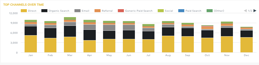
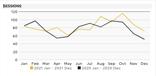
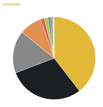
Marketing Graphs & Charts for Your Presentation

Graphs provide an illustration of trends in data. However, not all graphs paint the same picture. 

Bar Graphs are perfect for side-by-side comparisons such as benchmarks to progress, industry standards to the company’s data, last year to this year, and rankings of categories in ascending or descending order. Bar graphs highlight whole numbers but are most effective when the differences are more noticeable. 

Line Graphs best demonstrate growth or decline over time. Multiple related data points are overlayed and can illustrate correlation and trends in many areas such as conversion or revenue. Line graphs are better at showing small incremental changes over time than bar graphs.  

Area graphs combine the looks of bar and area graphs by using solid color between lines. This helps to show a part of a whole with overlapping data points measured usually over time.  Consider using an area graph when discussing social media platform and mailing lists performance while comparing them to the overall growth of new customers.  

Charts show a static number and how categories represent a part of a whole; 100% split into slices. A pie chart is perfect when percentages are more relevant than actual numbers (though raw numbers can still be visible). Remember, it is best to not overload your pie chart with too many categories and to use colors either inline with branding guidelines or easily distinguished.  

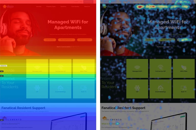
Website Heat Maps to Visualize User Engagement

Heat maps can be a fun and easy way to demonstrate data.  

Website heat maps visually demonstrate how users interact with a website.  They will show how far users scroll, where their mouse hovered and where they click.  This is valuable to identify where changes to a webpage should be and what changes to make in order to maximize the user experience and increase website conversions. 

heatmap


Marketing Data Visualization Tips

Clearly identify the purpose of your visuals and label all appropriate measuring conventions. Demonstrate your message with the data while painting the whole picture with your words. As mentioned with heat maps, presenting the same data in different forms can further express your findings and trends. 

While Excel and Google Sheets have a wide range of charts and graphs available to convert your tables into visual data, there is sometimes a vast learning curb associated with these programs. In this digital era, there are a vast number of online tools and software available to take the additional work off your plate. With a little bit of research, you can choose a dashboard system that creates graphs and charts for you. Google Analytics, HubSpot, DashThis, and Tableau are just a few places to go to take the work out of developing relevant visual representations. 


Did you find this article helpful?
Subscribe and get our upcoming posts in your inbox
  • Get the Marketing Resources You Need By Leading Sales Initiatives
  • Sales KPIs and How to Set Up Your HubSpot Dashboard
  • Should I Outsource My Traffic Reporting/Monitoring

Robb Luther

A lifetime resident of Ligonier, Pennsylvania, Robb joined PIC as an Internet Marketing Consultant in September 2007. Robb’s work experience covers a full range of website design and development, marketing (both online and off), and training responsibilities.

More than just great websites.
Marketing strategies for growth.

Call Today 412 942 0222 <>